Motion Design And The New Era Of Digital Communication
Key Takeaways
- Motion can direct attention, explain sequences, and make digital experiences feel more responsive.
- Static visuals remain valuable for fast scanning, reference material, and simple comparisons.
- Animation should serve a specific communication goal instead of filling space with movement.
- Performance, accessibility, and user control should shape motion decisions from the start.
- A consistent visual system helps still images, video, interface animation, and social content feel connected.
Table Of Contents
- Why Motion Matters
- Static And Motion Content Serve Different Jobs
- Common Uses For Animated Visuals
- How Motion Makes Messages Clearer
- Design Principles For Better Motion
- Motion, File Size, And Page Performance
- Accessibility And User Control
- A Practical Motion Design Workflow
- Common Mistakes To Avoid
- What To Expect From Digital Motion
Digital communication now happens across websites, apps, online stores, presentations, social channels, and product interfaces. In each setting, audiences make quick decisions about what deserves their attention. Motion design can help establish focus by showing what changed, what to do next, or how an idea unfolds over time.
That does not mean every design needs continuous movement. Effective animation has a clear role, such as demonstrating a feature, confirming an action, or creating a short visual transition. A GIF background remover can also help turn a product, mascot, or reaction into a reusable transparent loop that fits naturally over different page colors and layouts.
Why Motion Matters
Motion adds time and sequence to visual communication. A still graphic can show a finished product, while a short animation can show how that product opens, changes, connects, or solves a problem. This difference is useful when the message depends on cause and effect.
It can also make interfaces easier to understand. A button that changes state after a click, a panel that opens from the related menu item, or a progress indicator that shows activity can give people useful feedback. The movement should reinforce the action the user already took, rather than introduce a separate distraction.
Static And Motion Content Serve Different Jobs
Static design is not being replaced. It is often the best option when a person needs to scan a headline, compare features, save a reference image, or understand information at their own pace. A well-designed still image can communicate quickly without requiring a viewer to wait for a sequence to finish.
Motion is more useful when the viewer benefits from seeing a process. It can reveal steps in order, show a before-and-after change, or guide the eye through a complicated composition. The strongest digital experiences usually combine both formats instead of treating one as automatically better.
- Use static visuals for instructions, comparison points, diagrams, and key messages.
- Use motion for demonstrations, state changes, transitions, and short stories.
- Use both together when a page needs a stable structure with selective visual energy.
Common Uses For Animated Visuals
Motion design can support many practical communication tasks. On a product page, it may show a 360-degree view, a material detail, or a simple setup process. In social content, a short loop can make a product launch, announcement, or tutorial easier to notice while people scroll.
- Product demonstrations: Show how an object works, moves, assembles, or changes.
- Interface feedback: Confirm submissions, saved items, loading states, and completed actions.
- Educational content: Break a complex system into smaller, more readable steps.
- Presentation graphics: Introduce sections and reveal charts or diagrams in a controlled order.
- Brand moments: Use logo animation, icon movement, or short loops to add personality without changing the core identity.
How Motion Makes Messages Clearer
Good motion reduces the amount of information competing for attention at one time. Rather than placing every detail into one crowded image, a sequence can introduce the problem, show the action, and finish with the result. That structure can make a message easier to follow, especially when the topic involves steps or change.
Timing matters as much as movement. Text should remain visible long enough to read, and important details should not race past the viewer. A quick transition can communicate energy, but an explanatory sequence needs enough time for people to absorb what they are seeing.
Design Principles For Better Motion
Give Every Movement A Purpose
Before animating an element, identify the intended outcome. Ask whether the movement directs attention, provides feedback, explains a relationship, or supports a brand tone. If it does none of those things, a static treatment may be more effective.
Use Consistent Patterns
Repeated motion behaviors help people learn an interface. If panels open in one direction and close in another without a reason, the experience can feel unpredictable. Consistent timing, easing, and direction create a calmer, more understandable system.
Keep The Focus Narrow
When several elements move at once, viewers may not know where to look. Prioritize one primary action, then use quieter supporting movement only when it improves the message. This approach also helps a design feel more polished across smaller screens.
Motion, File Size, And Page Performance
Animation should not make a page difficult to use. Large media files, oversized dimensions, and unnecessary autoplay sequences can create a sluggish experience, particularly on mobile connections. Plan the asset for its destination before export, including its dimensions, duration, frame rate, and whether it needs transparency or sound.
Managing cumulative layout shift helps preserve a stable reading and shopping experience while visual assets load. Reserve enough space for media before it loads so the page does not jump as an animation appears.
- Use the shortest duration that communicates the idea.
- Reduce visual detail that is not noticeable at the final display size.
- Provide a poster frame or a still alternative when autoplay is unnecessary.
- Test the asset within the real page or app, not only in editing software.
Accessibility And User Control
Motion can be uncomfortable or distracting for some people, particularly when it flashes, scrolls unexpectedly, or continues without a clear purpose. Important information should never exist only inside an animation. Provide readable text, clear labels, or a still image so the message remains available in more than one form.
The guidance on animation from interactions emphasizes avoiding unnecessary movement and supporting people who prefer reduced motion. In practice, that means respecting device preferences, minimizing decorative effects, and allowing users to pause or avoid persistent movement when appropriate.
A Practical Motion Design Workflow
- Define the placement: Identify the website, app, presentation, email, or social format where the asset will appear.
- Write the message: Reduce the communication goal to one direct sentence.
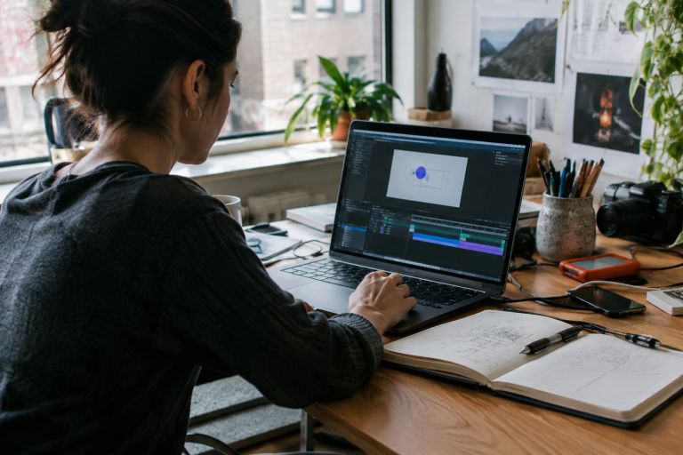
- Plan the sequence: Sketch the first frame, main action, and final frame before animating.
- Build reusable assets: Keep type, colors, icons, and product visuals aligned with the wider brand system.
- Review in context: Check timing, readability, contrast, and loading behavior on the intended device.
Common Mistakes To Avoid
- Adding movement because a page feels empty rather than because motion explains something.
- Using loops with abrupt restarts that become distracting after repeated viewing.
- Animating text too quickly for comfortable reading.
- Relying on color or motion alone to communicate a status change.
- Exporting a high-quality asset without checking how it affects the live page.
What To Expect From Digital Motion
Motion design will continue to become more connected to responsive layouts, product interactions, and content systems. Teams will need assets that work across different screen sizes and formats while preserving a recognizable visual style.
The best work will remain purposeful rather than excessive. When movement supports clarity, performance, and accessibility, it becomes a practical communication tool. It can help people understand products, navigate interfaces, and follow ideas with less effort.